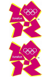
 The new London 2012
 logo brand has been roundly criticised for being ugly and looking like cartoon pornography, and even a petition has been set up to demand its change - now with more than 36,000 signatures.
But that's not all that is wrong with it. A section of the animated film that was on the London 2012 website has had to be removed after fears that it might cause epileptic seizures, but they plan to re-edit the film to remove the clip that has caused eight epileptic fits already - the section being "a diver diving into a pool which had multi-colour ripple effects."
So not only is the new logo ugly as hell, and has caused an uprising of opinion against it, it has also caused problems for those suffering epilepsy. I can't understand how they managed to spend £400,000 on it, especially since it doesn't even work properly! They certainly should have checked the potential health risks of such a video, but they obviously didn't, since it breached Ofcom guidelines.
Good start there, London 2012! Look on the bright side - things can only get better, eh? After all, you've only got five years, one month, and 21 days left! What could possibly go wrong in that time?!
Image by Theo Spark
Sources: BBC, The Times, The Telegraph
06 June 2007
Olympics Cartoon Porn Animation Causes Epileptic Fits
Posted by
ThunderDragon
@
11:06 am
![]()
Labels: London 2012, Sport, Wasting Taxpayer's Money
04 June 2007
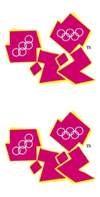
Cartoon Porn Made New 2012 Olympics Logo
 The new logo for the London Olympics of 2012 has been unveiled. It is, as described by the BBC, a "jagged emblem, based on the date 2012, comes in a series of shades of pink, blue, green and orange." The "brand" (it's not a logo, it's a 'brand'...) is said to be aimed the young people, hence its "modern" take on the Olympic colours and it's "innovative" design.
In fact, it is just shit. How on earth can £400,000 be justified on being spent on that?! It doesn't look like the "2012" it is supposed to resemble, but more like a bad logo for an 80s product. Or, as it has been described [and once you see it the design will always look like it] Lisa Simpson performing oral sex.
It is so bad that an online petition was set up within hours of the "jagged" logo being unveiled, and already has nearly 6,500 signatures.
Tessa Jowell says that the logo "sums up what London 2012 is all about." If that logo sums it up, then we're in for a really shit, and cartoon pornographic, Olympics.
Other bloggers on the logo: Theo Spark, Devil's Kitchen, Mr Eugenides
Images by Theo Spark
UPDATE: Theo again excelling himself, showing how we are being truly shafted by £400,000 of our money being spent on a truly terrible logo "brand". I mean, had they paid just £10,000 it might have been worth it. But £400,000?! Not a chance. Far better to have held an open competition for the design - it would have cost less and looked far better!
The petition to change the logo has reached more than 13,600 signatures - and is still growing. If you haven't already, please go and sign it, and save us from this horrible logo!
UPDATE 2: It can also cause epileptic seizures.
Sources: BBC, The Telegraph, The Times
Posted by
ThunderDragon
@
6:18 pm
![]()
Labels: Absurdity, London 2012, Sport, Wasting Taxpayer's Money


